A design can have all the right elements and still feel “off.” Maybe one object looks too large, one side feels heavier than the other, or something just doesn’t seem to fit. Often, two important principles are involved: proportion and balance.
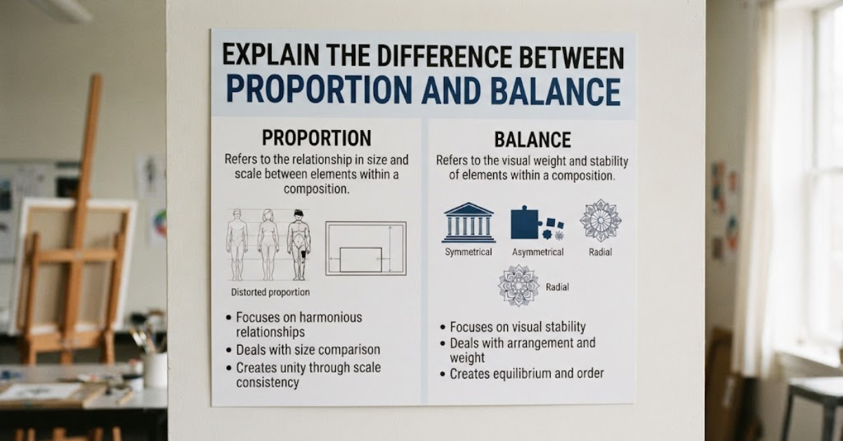
If you’re trying to explain the difference between proportion and balance, the easiest starting point is this: proportion deals with the size and relationship of elements, while balance deals with how visual weight is distributed throughout a composition.
The two principles are closely connected, which is why they’re sometimes confused. However, they solve different visual problems. Understanding the distinction can help you create better artwork, photographs, graphic designs, interiors, and other visual compositions.
What Is Proportion in Art and Design?
Proportion refers to the relationship between the sizes, dimensions, or quantities of different elements in a composition.
It isn’t simply about whether something is “big” or “small.” Proportion asks how one element compares with another.
For example, imagine a drawing of a person with a head that’s much larger than the body. The individual parts might be beautifully drawn, but their relationship to one another could feel unnatural because the proportions are inconsistent.
Proportion can involve:
- Height
- Width
- Length
- Scale
- Size relationships
- Distance between elements
- Parts compared with a whole
In other words, proportion is about relationships between sizes.
A Simple Proportion Example
Imagine a table with four chairs.
If the table is extremely small but the chairs are unusually large, the relationship between the objects may look awkward. The problem isn’t necessarily that any individual object is poorly designed. Their proportions don’t work well together.
Now imagine the same table with appropriately sized chairs. The objects relate more naturally, and the entire arrangement feels coherent.
That’s proportion at work.
What Is Balance in Art and Design?
Balance refers to the distribution of visual weight within a composition.
Visual weight doesn’t necessarily mean physical weight. A large dark object can feel visually heavier than a small pale object, even if the smaller object is physically denser.
Balance is concerned with whether the composition feels stable or intentionally arranged.
For example, imagine a photograph with a large dark building on the left side and almost nothing on the right. The image may feel visually weighted toward the left.
Adding another object, changing the size of the building, or leaving more deliberate space can alter the balance.
What Creates Visual Weight?
Several factors can influence visual weight, including:
- Size
- Color
- Contrast
- Texture
- Shape
- Position
- Detail
- Density
- Direction
A bright red shape can attract more attention than a large gray shape. Likewise, a highly detailed object may carry more visual weight than a simple shape.
Explain the Difference Between Proportion and Balance
So, how do you explain the difference between proportion and balance in the simplest possible way?
Think of it like this:
Proportion asks: “How do these elements relate in size?”
Balance asks: “How is visual weight distributed?”
That’s the core distinction.
| Proportion | Balance |
| Focuses on size relationships | Focuses on visual weight |
| Compares parts with one another | Considers the composition as a whole |
| Deals with scale and dimensions | Deals with stability and distribution |
| Can affect realism and harmony | Can affect visual comfort and emphasis |
| Often concerns relationships between objects | Often concerns relationships across the entire composition |
The two principles overlap, but they aren’t interchangeable.
Proportion vs Balance: An Easy Example
Imagine a poster containing a large photograph, a headline, a logo, and a paragraph of text.
Suppose the logo is much larger than the headline. That may create a proportion problem because the sizes don’t communicate the intended hierarchy.
Now imagine the photograph occupies almost the entire left side of the poster while the right side contains only a tiny logo and a few words.
That could create a balance problem because the visual weight is concentrated heavily on one side.
The same poster can have good proportions but poor balance—or good balance but awkward proportions.
Why Proportion Matters
Proportion helps elements look like they belong together.
In visual art, it can influence whether something appears realistic, believable, harmonious, or intentionally stylized.
Consider a portrait.
The relationship between the eyes, nose, mouth, head, neck, and shoulders contributes to how the face is perceived. Even small changes in those relationships can dramatically alter the appearance of the person.
Proportion is also important outside representational art.
Graphic designers use proportion to establish hierarchy. Architects consider the relationship between rooms, windows, doors, and structural elements. Interior designers use proportion when selecting furniture for a room.
Why Balance Matters
Balance helps a composition feel organized.
Without balance, an image can sometimes feel as though it is tipping toward one side. That doesn’t always mean the design is bad—intentional imbalance can create tension or movement—but it should generally feel deliberate.
Balance helps answer questions such as:
- Where does the viewer’s eye go first?
- Does one area dominate too much?
- Is the composition visually stable?
- Are elements distributed effectively?
- Does the design feel calm, energetic, formal, or dynamic?
These are questions of visual weight rather than simple dimensions.
Types of Balance in Art
Balance can take several forms. The most common are symmetrical, asymmetrical, radial, and crystallographic balance.
Symmetrical Balance
Symmetrical balance occurs when elements are distributed similarly on either side of an implied central axis.
Think of a butterfly.
The left and right wings mirror one another, creating a strong sense of stability.
Symmetrical compositions often feel:
- Formal
- Orderly
- Stable
- Traditional
- Calm
This type of balance is common in architecture, logos, formal portraits, and decorative designs.
Asymmetrical Balance
Asymmetrical balance uses different elements that nevertheless create a comparable sense of visual stability.
For example, a large pale shape on one side might be balanced by several smaller, darker shapes on the other.
The objects don’t have to match.
What matters is their visual weight.
Asymmetrical balance is especially common in modern graphic design, photography, advertising, and editorial layouts.
Radial Balance
Radial balance occurs when elements spread outward from a central point.
Examples include:
- A flower
- A circular mandala
- A spiral arrangement
- A round architectural ceiling
- A wheel
The repeated outward structure creates a strong sense of organization.
Crystallographic Balance
Crystallographic balance, sometimes called mosaic balance, involves repeated visual elements distributed relatively evenly throughout a composition.
A patterned textile is a good example.
Instead of one obvious focal point, the viewer encounters similar visual activity across the entire surface.
Types of Proportion in Art and Design
Proportion can also be approached in different ways.
Human Proportion
Artists studying the human figure pay close attention to relationships between body parts.
For example, the length of the torso relative to the legs can influence whether a figure appears natural or deliberately stylized.
Architectural Proportion
Architecture often depends on relationships between dimensions.
The size of a doorway relative to a wall, the height of windows compared with a building, and the relationship between rooms can all influence how a structure feels.
Golden Ratio
The golden ratio is a mathematical relationship often discussed in art, architecture, and design.
It is approximately 1.618:1.
The golden ratio has a long history in mathematical and aesthetic discussions, although popular claims that famous artworks or buildings were systematically designed around it are sometimes overstated.
It’s better to treat the golden ratio as one design concept rather than a universal formula for beauty.
How Proportion and Balance Work Together
Although proportion and balance are different, they constantly interact.
Changing the size of one element changes its proportion relative to other elements. But it can also change the composition’s visual weight, which affects balance.
For example, imagine a small photograph placed on the right side of a page.
If you enlarge that photograph, two things happen:
- Its proportion relative to the page changes.
- Its visual weight increases, potentially changing the balance.
This is why adjusting one design element can have several effects at once.
Proportion Does Not Always Mean Realism
A common misunderstanding is that good proportion always means realistic proportion.
That’s not true.
Artists can intentionally distort proportion to communicate an idea or create a particular style.
Consider cartoon characters with oversized heads or tiny bodies. Their proportions aren’t realistic, but they can be completely appropriate for the visual language of the artwork.
In this case, the unusual proportions are intentional.
The important thing is consistency and purpose.
Balance Does Not Always Mean Symmetry
Another common mistake is assuming that a balanced composition must be symmetrical.
It doesn’t.
A composition can be strongly asymmetrical while still feeling balanced.
Imagine a large, light-colored circle on the left side of an image and several smaller, dark shapes on the right. The objects aren’t equal, but their combined visual weights can create equilibrium.
This is why balance in art is more complicated than simply dividing an image into equal halves.
Proportion and Balance in Photography
Photographers use both principles constantly, sometimes without thinking about the terminology.
Imagine a portrait where the subject occupies most of the frame.
The photographer needs to consider the proportions of the person within the frame, as well as the relationship between the subject and the surrounding environment.
At the same time, the photographer must consider balance.
Where is the subject positioned? Is there too much empty space? Are distracting objects pulling attention away from the face?
Changing the crop can alter both proportion and balance.
Proportion and Balance in Graphic Design
Graphic designers rely heavily on these principles when creating posters, websites, advertisements, brochures, and social media graphics.
Suppose a website has:
- A large headline
- A hero image
- Several buttons
- Navigation links
- Supporting text
The designer has to establish appropriate proportions between these elements.
Then they need to distribute the visual weight so the page doesn’t feel overloaded in one area.
This is where principles such as visual hierarchy, alignment, white space, contrast, scale, and balance work together.
Proportion and Balance in Interior Design
Walk into a room where the furniture is too large for the space, and you’ll immediately notice something feels wrong.
That’s largely a proportion issue.
A huge sectional sofa in a tiny room can overwhelm the architecture. Conversely, several tiny pieces of furniture in a very large room can feel disconnected.
Balance enters the picture when considering how furniture, colors, textures, and objects are distributed throughout the room.
A large piece on one side may need smaller objects or stronger visual elements elsewhere to create equilibrium.
How to Improve Proportion in Your Work
If your artwork or design feels awkward, check the relationships between sizes.
Try these steps:
- Compare each element with the whole.
- Compare objects with one another.
- Check height-to-width relationships.
- Look at the amount of space between elements.
- Ask whether the scale supports the purpose of the design.
- Step back and view the composition as a whole.
Sometimes the problem becomes obvious when you stop looking at individual details.
How to Improve Balance in Your Work
To improve balance, look at visual weight rather than simply counting objects.
Ask yourself:
- Is one side noticeably heavier?
- Are dark or bright elements concentrated in one area?
- Is there enough breathing room?
- Does one object dominate unexpectedly?
- Could a smaller element balance a larger one?
- Would moving an object improve the composition?
You can also squint at your artwork.
It sounds strange, but it works.
When you squint, small details become less noticeable, allowing you to see larger areas of light, dark, color, and visual weight.
Proportion and Balance: A Practical Exercise
Here’s a simple exercise you can try with almost any image.
Choose a photograph, drawing, or poster and divide it mentally into four sections.
Then examine it in two different ways.
First, Study Proportion
Ask:
- How large is the main subject?
- How large are the secondary elements?
- How much space does each element occupy?
- Are the relationships between objects believable or intentional?
Next, Study Balance
Ask:
- Which area feels visually heaviest?
- Where is the focal point?
- Is the visual weight evenly distributed?
- Does the composition feel stable or intentionally dynamic?
You’ll quickly see that you’re asking two different sets of questions.
That’s the easiest way to understand the distinction.
Common Mistakes When Learning These Principles
Confusing Size With Balance
A large object isn’t automatically unbalanced.
Its position, color, contrast, texture, and relationship with other elements all matter.
Assuming Equal Means Balanced
Two sides don’t have to contain identical objects.
Asymmetrical compositions can be beautifully balanced.
Treating Proportion as a Fixed Rule
There isn’t one universal proportion that every artwork must follow.
Different styles have different visual conventions.
Ignoring Context
An oversized element might be a mistake in one design but the main creative idea in another.
Always consider the purpose of the composition.
Frequently Asked Questions
What is the difference between proportion and balance?
Proportion describes the relationship between the sizes and dimensions of elements, while balance describes how visual weight is distributed throughout a composition.
What is proportion in art?
Proportion in art refers to the size relationship between different parts of an artwork or between an object and the overall composition.
What is balance in art?
Balance in art is the distribution of visual weight among elements. It can be symmetrical, asymmetrical, radial, or based on repeated patterns.
Is proportion the same as scale?
Not exactly. Scale often describes the size of an object in relation to a reference or environment, while proportion describes relationships between parts or elements.
For example, a chair can be large in relation to a room but still have good proportions between its seat, back, and legs.
Can a design have good proportion but poor balance?
Yes. An artwork can have appropriately sized elements while still concentrating too much visual weight on one side.
Can a design have good balance but unusual proportions?
Yes. A composition can be visually balanced even when individual elements are intentionally exaggerated or distorted.
Is symmetry the same as balance?
No. Symmetry is one way to achieve balance, but balance can also be asymmetrical or radial.
Why are proportion and balance important in design?
They help organize visual information, establish hierarchy, improve harmony, and guide the viewer’s attention.
How can beginners practice proportion and balance?
Start with simple compositions. Compare the sizes of objects to one another for proportion, then step back and evaluate where the visual weight falls for balance.
Conclusion: Proportion and Balance Explained
If you want to explain the difference between proportion and balance, remember one simple distinction:
Proportion is about relationships in size. Balance is about relationships in visual weight.
Proportion helps determine whether elements relate appropriately to one another. Balance determines whether the composition feels visually stable, organized, or intentionally dynamic.
The two principles often work together. Changing the size of an object can affect both its proportion and its visual weight, which means a small adjustment can change the entire composition.
Whether you’re drawing a figure, designing a logo, arranging a room, creating a website, or taking a photograph, learning to recognize these relationships will sharpen your visual judgment.
The best way to learn is to practice. Pick an image today and analyze it twice: first for proportion, then for balance. Once you learn to separate those two ideas, you’ll start noticing why certain compositions work—and why others feel just a little off.