
A drawing can have beautiful lines, colors, and details, yet still feel strangely unbalanced. Often, the problem isn’t what’s been added to the artwork—it’s what’s happening in the space around it.
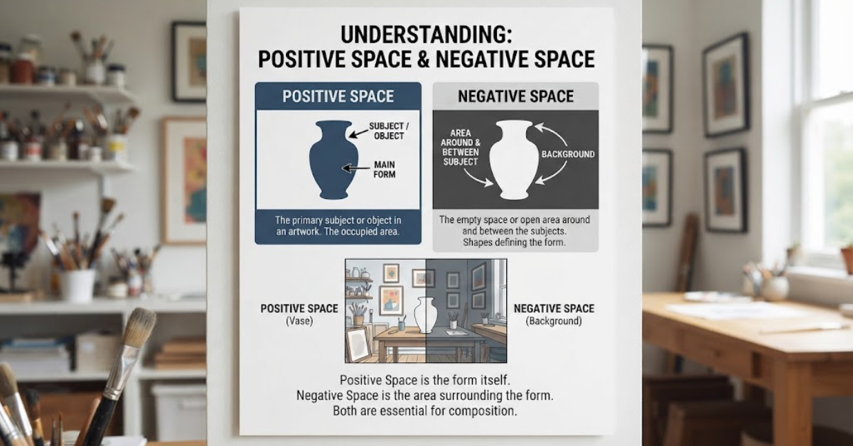
Understanding the difference between positive space and negative space is one of the most useful concepts in art and design. Positive space usually contains the main subjects or objects, while negative space is the area surrounding, between, or inside those subjects.
Once you understand positive space vs negative space, you’ll start noticing the concept everywhere: in paintings, photography, logos, architecture, typography, illustrations, and even everyday objects.
Let’s break down what these two types of space mean, how they work together, and how you can use them to create stronger visual compositions.
What Is Positive Space?
Positive space is the part of an artwork or design occupied by recognizable subjects, objects, shapes, or forms.
In simple terms, it’s the area where the “stuff” is.
For example, imagine a drawing of a person standing in a field. The person’s body would be positive space because it is the primary subject. If there are trees, buildings, flowers, or other visible objects, those can also occupy positive space.
Positive space doesn’t have to be complicated or detailed. A simple black circle on a white page is positive space because the circle is the identifiable form that attracts attention.
Examples of Positive Space
Positive space can include:
- A person in a portrait
- A building in an architectural illustration
- A flower in a botanical drawing
- A car in a photograph
- Letters in a typography design
- Animals in a landscape
- Geometric shapes in a poster
- Objects in a still-life painting
The important thing is that positive space generally represents the forms that the viewer identifies as subjects or objects.
What Is Negative Space?
Negative space is the area around, between, or sometimes inside the main subjects of an artwork.
It is often described as “empty space,” but that description can be misleading. Negative space isn’t necessarily useless or blank. In good composition, it can be just as important as the objects themselves.
Take the same example of a person standing in a field. The area surrounding the person may be negative space, depending on how the composition is defined. The gaps between the person’s arms and body can also function as negative space.
In a logo, negative space can even form a hidden image or message.
Examples of Negative Space
Negative space can appear as:
- The sky surrounding a building
- The background around a person
- Gaps between objects
- Spaces between letters
- Empty areas around a logo
- Open areas inside shapes
- The space between a subject and the edge of an image
The key idea is that negative space gives the positive forms room to exist visually.
Difference Between Positive Space and Negative Space
So, what is the difference between positive space and negative space?
The simplest explanation is this:
Positive space is occupied by the main forms or subjects, while negative space is the surrounding or unoccupied area that exists around and between those forms.
Here’s a quick comparison:
| Positive Space | Negative Space |
| Contains the main subject or object | Surrounds or separates the subject |
| Usually attracts direct attention | Helps shape how the subject is perceived |
| Includes figures, objects, and forms | Includes gaps, backgrounds, and open areas |
| Creates visual content | Creates breathing room |
| Can define the focal point | Can improve balance and emphasis |
Neither one is automatically more important than the other. They work together to create the overall composition.
Positive Space vs Negative Space: A Simple Example
Imagine drawing a black apple on a white sheet of paper.
The black apple is positive space.
The white area surrounding the apple is negative space.
Now imagine placing another apple next to it. The space between the two apples becomes particularly interesting because it helps define their individual shapes.
Move the apples closer together, and the negative space changes.
Move them farther apart, and the composition feels different again.
That’s why negative space isn’t simply “nothing.” Changing it can completely change the visual relationship between objects.
Why Negative Space Matters in Art and Design
One common mistake beginners make is focusing entirely on the objects they’re drawing.
They might carefully observe a person’s face, for example, while ignoring the shapes surrounding the head and shoulders. This can make proportions and composition more difficult to judge.
Looking at negative space gives you another way to understand the image.
Instead of asking:
“How do I draw this object?”
you can also ask:
“What shape is the space around this object making?”
That small change in perspective can make drawing much easier.
Negative Space Creates Balance
Negative space can prevent a composition from feeling crowded.
When every part of an image is filled with objects, the viewer may not know where to look. Strategic empty areas create visual breathing room.
This is particularly important in:
- Graphic design
- Web design
- Photography
- Advertising
- Editorial layouts
- Interior design
Negative Space Directs Attention
Where you leave empty space can influence where the viewer looks.
For example, if a person in a photograph is looking toward the right side of the frame, leaving some negative space in front of them can make the image feel more natural.
The direction of the subject’s gaze has somewhere to go.
How Positive and Negative Space Work Together
The relationship between positive and negative space is more important than either concept by itself.
Think of them as two sides of the same visual system.
If you increase the amount of positive space, you generally reduce the amount of negative space available. If you remove objects, the surrounding negative space becomes more prominent.
This relationship affects:
- Balance
- Proportion
- Emphasis
- Movement
- Rhythm
- Visual hierarchy
- Overall composition
A strong composition usually isn’t about filling every available area. It’s about deciding where visual information belongs—and where it doesn’t.
Positive and Negative Space in Photography
Photography provides an easy way to see this principle in action.
Imagine a photograph of a single bird flying across a large sky. The bird occupies relatively little of the frame, while the sky takes up most of the image.
The bird acts as the positive form, while the surrounding sky provides negative space.
That empty sky can make the bird appear:
- Isolated
- Small
- Free
- In motion
- Visually emphasized
Now crop the photograph tightly around the bird. The balance changes immediately.
The bird occupies more of the frame, and there is less negative space. The photograph may feel more intense or crowded as a result.
Positive and Negative Space in Graphic Design
Graphic designers use space deliberately to make information easier to understand.
Consider a poster containing a headline, photograph, logo, and several lines of text. If everything is packed tightly together, the viewer may struggle to determine what information matters most.
Adding appropriate negative space creates separation.
For example, designers might use negative space to distinguish:
- The headline from the body text
- The image from the written information
- One section from another
- The logo from surrounding elements
- Important information from secondary details
This is one reason professional designs often look “clean” even when they contain relatively little visual content.
Positive and Negative Space in Logo Design
Logo designers frequently use negative space in clever ways.
A logo might contain a shape that appears to be one thing at first glance but reveals another image when you look more carefully.
This is called negative space design, and it can make a logo memorable without requiring additional visual elements.
For example, the empty area between two shapes might create the outline of an animal, letter, or symbol.
The viewer’s brain naturally looks for meaningful forms, so a well-designed negative-space logo can reward closer attention.
Positive and Negative Space in Typography
Space is just as important when you’re working with words.
Typography involves several types of spacing, including:
- Space between individual letters
- Space between words
- Space between lines
- Space around blocks of text
- Space between headings and paragraphs
If letters are too close together, text can become difficult to read. If they’re too widely spaced, the word may lose visual cohesion.
Similarly, generous space around a headline can make it stand out.
This shows that negative space isn’t limited to drawing and painting. It is a fundamental part of visual communication.
Positive and Negative Space in Drawing
Artists can use negative space as a practical drawing tool.
Suppose you’re drawing a chair. Instead of concentrating only on the chair itself, look at the shapes created between its legs, underneath the seat, and around the backrest.
Those spaces can provide useful reference points.
Try This Exercise
Choose a simple object and follow these steps:
- Place the object in front of you.
- Don’t focus on its name or purpose.
- Look at the shapes around it.
- Sketch those surrounding shapes first.
- Compare your drawing with the original object.
- Add the object’s main forms afterward.
This exercise helps train your eye to see relationships rather than relying entirely on symbols or assumptions.
Is Negative Space Always Empty?
No.
This is an important distinction.
“Negative space” doesn’t necessarily mean an area containing absolutely nothing. It refers to the visual space that surrounds, separates, or defines the positive forms.
A background can contain color, texture, patterns, or even recognizable details while still functioning as negative space in a particular composition.
For example, a blue sky filled with subtle clouds may still function as negative space around a bird.
The terms are about visual relationships, not simply whether an area is literally blank.
Can One Area Be Positive and Negative Space?
Yes, depending on how you analyze the composition.
Space can be understood relative to the forms around it.
For instance, the area inside a letter or object may function as negative space within that form, while the same region could be considered part of the broader composition’s background.
This is why the distinction isn’t always completely rigid.
Artists and designers use positive and negative space as ways of analyzing visual relationships rather than as absolute labels that apply identically in every situation.
How to Use Positive and Negative Space Effectively
If you’re creating artwork or a design, you don’t need to calculate space mathematically. Start by paying attention to relationships.
1. Identify the Main Subject
Ask yourself what you want the viewer to notice first.
That subject will generally occupy the primary positive space.
2. Examine the Surrounding Area
Look at the shapes around the subject.
Are they too cramped? Too large? Unevenly distributed?
3. Check the Balance
Imagine dividing the composition into different areas.
Does one side feel significantly heavier than the other?
Negative space can sometimes correct that imbalance.
4. Consider the Edges
Don’t ignore the edges of the canvas or frame.
The distance between your subject and the edge can dramatically affect how the composition feels.
5. Remove Unnecessary Elements
Sometimes the best way to improve a design isn’t to add something.
It’s to take something away.
Removing unnecessary objects can create useful negative space and make the main subject more noticeable.
Common Mistakes With Positive and Negative Space
Understanding the concept is relatively easy. Applying it effectively takes practice.
Here are a few common mistakes.
Filling Every Empty Area
Many beginners assume that an empty area means something is missing.
That’s not necessarily true.
Empty space can provide contrast and emphasis.
Ignoring Background Shapes
When drawing, people often concentrate exclusively on the subject.
But background shapes can reveal proportion problems that aren’t obvious when you’re only looking at the object.
Making Everything Equally Important
If every element demands attention, nothing has clear priority.
Positive and negative space can help establish visual hierarchy.
Using Too Much Negative Space
Negative space is useful, but excessive empty space can sometimes make an element feel disconnected from the rest of the composition.
The goal isn’t to maximize empty space. It’s to use it intentionally.
Positive Space vs Negative Space in Everyday Life
You don’t have to visit an art gallery to see this concept.
Look around you.
A mug sitting on a desk creates positive space. The area surrounding the mug creates negative space.
A person standing against a wall creates positive and negative relationships.
A doorway, window, bookshelf, road, building, or even a tree against the sky can demonstrate the same principle.
Once you start looking for these relationships, you’ll notice them almost everywhere.
Why Artists Study Both Types of Space
Learning to recognize positive and negative space helps artists move beyond drawing what they think something looks like.
Instead, they begin observing:
- Shape
- Proportion
- Distance
- Scale
- Alignment
- Composition
- Visual weight
This is particularly useful for beginners because it provides a more objective way to judge a drawing.
Instead of thinking, “That doesn’t look right,” you can ask, “Is this gap wider than it should be?” or “Does this shape align with the space next to it?”
Those questions are much easier to act on.
A Quick Way to Remember the Difference
If you keep mixing up the two terms, use this simple memory trick:
Positive space = the forms.
Negative space = the spaces around the forms.
Think about a photograph of a person standing against a plain wall.
The person is the obvious positive form.
The surrounding wall acts as negative space.
The two together create the complete composition.
Frequently Asked Questions
What is the difference between positive space and negative space?
The difference between positive space and negative space is that positive space contains the primary forms, objects, or subjects, while negative space surrounds, separates, or exists within those forms.
What is positive space in art?
Positive space is the area occupied by the recognizable subjects or forms in an artwork. Examples include people, animals, buildings, objects, letters, and geometric shapes.
What is negative space in art?
Negative space is the area surrounding or separating the main forms. It can also refer to enclosed areas within shapes, depending on the composition.
Is negative space the same as empty space?
Not necessarily. Negative space is often visually open, but it doesn’t have to be completely blank. It describes a spatial relationship between forms rather than simply an absence of content.
Why is negative space important?
Negative space can improve balance, readability, emphasis, proportion, and visual hierarchy. It also gives important elements room to stand out.
Can negative space be used in logo design?
Absolutely. Designers often use negative space to create hidden shapes, letters, symbols, or secondary meanings within a logo.
What is positive space vs negative space in photography?
In photography, positive space generally refers to the main subject or subjects, while negative space is the surrounding area that gives those subjects room and helps establish the composition.
How can I practice drawing negative space?
Choose a simple object and focus on drawing the shapes around it rather than the object itself. This can help you develop stronger observation and proportion skills.
Conclusion: Understanding Positive and Negative Space
The difference between positive space and negative space comes down to a simple relationship: positive space contains the main forms, while negative space surrounds and defines them.
But the idea goes much deeper than that.
Good artwork isn’t created only by deciding what to include. It’s also shaped by decisions about what to leave open, how much room to give each element, and how different shapes interact.
Whether you’re drawing, taking photographs, designing a logo, arranging a website, or working with typography, learning positive space vs negative space can make your compositions more balanced and intentional.
The easiest way to start is to practice seeing both at the same time. Don’t just look at the object—look at the spaces around it. Once you train your eye to notice those relationships, composition becomes much easier to understand.
Next step: take a simple photograph or object and spend a few minutes identifying its positive and negative spaces. You’ll likely start seeing ordinary images in a completely different way.