
Color can completely change how a design feels. Put two colors next to each other and you might get energy and contrast; choose colors that sit close together and the same design can suddenly feel calm and cohesive.
That’s why understanding the difference between complementary colors and analogous colors is so useful. Both are common color schemes based on relationships found on the color wheel, but they create very different visual effects.
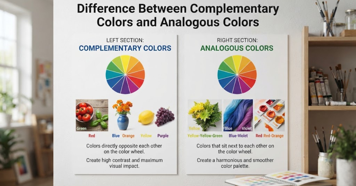
Complementary colors sit opposite each other on the color wheel and create strong contrast. Analogous colors sit next to each other and usually create a more harmonious, unified appearance.
Once you understand how these relationships work, choosing colors for paintings, websites, logos, illustrations, photography, interiors, and other creative projects becomes much easier.
What Are Complementary Colors?
Complementary colors are pairs of colors positioned opposite one another on a traditional color wheel.
Common examples include:
- Red and green
- Blue and orange
- Yellow and purple
Because complementary colors are far apart on the color wheel, they create a strong difference in hue when placed next to each other.
This contrast can make both colors appear more noticeable.
For example, a bright blue background can make an orange object stand out immediately. Similarly, red and green can create a highly noticeable combination.
Why Complementary Colors Create Contrast
Complementary colors have different hues, so the eye perceives a strong distinction between them.
Designers often use this relationship when they want something to attract attention.
Complementary color schemes can be useful for:
- Posters
- Advertisements
- Sports graphics
- Packaging
- Illustrations
- Logos
- Attention-grabbing buttons
- Digital interfaces
However, using two highly saturated complementary colors over large areas can sometimes feel intense. That’s why designers often adjust brightness, saturation, or proportion.
What Are Analogous Colors?
Analogous colors are colors that sit next to one another on the color wheel.
For example, an analogous color scheme might include:
- Blue
- Blue-green
- Green
Another could include:
- Red
- Red-orange
- Orange
Because analogous colors are close together in hue, they generally create a smoother visual transition than complementary colors.
They often feel connected because they share similar color characteristics.
Why Analogous Colors Feel Harmonious
Imagine a landscape filled with different shades of green, yellow-green, and blue-green.
Instead of creating sharp visual clashes, these colors flow into one another.
That’s the main strength of an analogous color scheme: harmony.
Analogous palettes are often useful when you want a design to feel:
- Calm
- Natural
- Relaxed
- Unified
- Comfortable
- Sophisticated
They’re especially common in nature-inspired artwork, interiors, illustrations, branding, and visual backgrounds.
Difference Between Complementary Colors and Analogous Colors
So, what is the difference between complementary colors and analogous colors?
The easiest answer is based on their positions on the color wheel.
Complementary colors are opposite each other. Analogous colors are next to each other.
Here’s a quick comparison:
| Complementary Colors | Analogous Colors |
| Located opposite each other | Located next to each other |
| Create strong contrast | Create visual harmony |
| Often feel energetic | Often feel calm or cohesive |
| Useful for emphasis | Useful for unity |
| Can appear bold and dramatic | Usually appear smoother |
| Examples: blue and orange | Examples: blue, blue-green, green |
Neither scheme is inherently better. The right choice depends on the mood and purpose you’re trying to create.
Complementary vs Analogous Colors on the Color Wheel
The color wheel is the easiest tool for understanding these relationships.
Imagine a traditional color wheel with primary, secondary, and intermediate colors.
Complementary Relationship
Find one color.
Then look directly across the wheel.
The color opposite it is its complement.
For example:
Blue → Orange
Red → Green
Yellow → Purple
This creates a complementary relationship.
Analogous Relationship
Instead of looking across the wheel, look at the colors immediately beside your chosen color.
For example:
Blue → Blue-green → Green
These colors form an analogous group.
You can think of complementary colors as creating a conversation between opposites, while analogous colors create a conversation between neighbors.
Complementary Color Examples
Let’s look at some practical examples.
Blue and Orange
Blue and orange are a classic complementary pair.
Blue tends to feel cool and calm, while orange is warmer and more energetic. Placing them together creates strong contrast.
This combination can work well when a design needs a clear focal point.
Red and Green
Red and green are opposite each other on many traditional color wheels.
The combination is naturally high in contrast, although its association with holidays can influence how viewers interpret it.
Designers may use less saturated versions of these colors when they want the relationship without an overly intense appearance.
Yellow and Purple
Yellow and purple create another strong complementary pairing.
A bright yellow element can stand out dramatically against a purple background.
This relationship is often useful when you want clear visual separation.
Analogous Color Examples
Analogous schemes offer a different visual experience.
Blue, Blue-Green, and Green
These colors transition naturally from cool blue toward green.
The result can suggest water, vegetation, sky, or other natural environments.
Yellow, Yellow-Orange, and Orange
This combination creates a warm palette.
It can communicate energy, sunlight, warmth, or enthusiasm.
Red, Red-Orange, and Orange
These colors create a fiery, warm progression.
They’re useful for artwork or designs that need warmth and visual energy without the sharp contrast of complementary colors.
Complementary Colors for Contrast
One of the biggest advantages of complementary colors is contrast.
Suppose you’re designing a website and want an important button to stand out.
A complementary accent can help separate that button from its surrounding background.
However, contrast isn’t only about choosing opposite hues. You also need to consider:
- Brightness
- Saturation
- Size
- Background color
- Text readability
- Accessibility
A complementary color combination can be visually striking but still difficult to read if both colors are highly saturated and similar in brightness.
Analogous Colors for Harmony
Analogous colors are often easier to combine because their hues are already closely related.
Imagine decorating a room with blue, blue-green, and green.
You can introduce different shades and tints while maintaining a connected overall appearance.
This makes analogous palettes useful when you want the viewer to experience the composition as one unified visual environment rather than a collection of competing elements.
How Saturation Changes Both Color Schemes
Hue isn’t the only thing that determines how a color combination feels.
Saturation also matters.
Two complementary colors at maximum saturation can appear extremely intense when placed side by side.
Lowering their saturation can make the same relationship softer and more sophisticated.
The same principle applies to analogous colors.
A palette made from highly saturated yellow, orange, and red can feel energetic. Muted versions of those same hues may feel warm and understated.
So don’t think of color schemes as rigid formulas. They’re starting points.
How Value Affects Color Combinations
Value refers to how light or dark a color appears.
This is particularly important for readability and visual hierarchy.
For example, a dark blue and a medium orange may have strong hue contrast. But if text and background don’t have enough light-dark separation, readability can still suffer.
When building a color palette, consider three things together:
- Hue — what color it is
- Saturation — how intense or muted it is
- Value — how light or dark it is
This gives you much more control than simply choosing colors from opposite or neighboring positions on a wheel.
When Should You Use Complementary Colors?
A complementary scheme is useful when you want contrast or emphasis.
Consider using complementary colors when:
- You need a strong focal point.
- Two elements need clear separation.
- You want an energetic visual style.
- You’re designing promotional material.
- You want a subject to stand out from its background.
- You need noticeable accents.
You don’t necessarily need to use equal amounts of both colors.
In fact, using one color as the dominant hue and its complement as a smaller accent can create a more controlled composition.
When Should You Use Analogous Colors?
An analogous scheme is a good choice when harmony and visual continuity are more important than dramatic contrast.
It can work particularly well for:
- Nature-themed designs
- Landscapes
- Interior spaces
- Branding
- Backgrounds
- Illustrations
- Relaxing interfaces
- Editorial designs
An analogous palette can also be a useful starting point when you’re unsure how to build a color scheme.
Choose a dominant color, then explore neighboring hues on the color wheel.
Can You Combine Complementary and Analogous Colors?
Yes.
You don’t have to choose one color relationship and use it exclusively.
A common approach is to build the main palette from analogous colors and then introduce a complementary color as an accent.
For example, imagine a design based primarily on:
Blue + blue-green + green
You could introduce a small amount of orange as an accent.
The analogous colors establish harmony, while the complementary orange creates emphasis.
This approach can provide both unity and contrast.
Complementary and Analogous Colors in Interior Design
These color relationships aren’t limited to artwork.
Interior designers use them to influence the feeling of a space.
An analogous room might combine:
- Blue walls
- Blue-green furniture
- Green plants
The result can feel cohesive and connected.
A complementary room might use a primarily blue palette with orange or warm orange-brown accents.
The contrast can draw attention to specific furniture, artwork, or architectural features.
Complementary and Analogous Colors in Graphic Design
Graphic designers often use these color schemes to establish hierarchy.
Imagine a poster with a predominantly blue background.
An orange headline or button immediately creates contrast because orange is complementary to blue.
On the other hand, a poster using blue, blue-green, and green may feel more seamless.
The choice depends on what the design needs to communicate.
If the goal is attention, complementary relationships can be useful.
If the goal is cohesion, analogous relationships can be a better starting point.
Complementary and Analogous Colors in Art
Painters have long used color relationships to control mood and emphasis.
A landscape might use analogous greens and blues to create a natural atmosphere, then introduce a small complementary warm color to draw attention to a person, building, or sunset.
Likewise, an artist might build an entire painting around complementary colors to create tension and energy.
Color theory doesn’t tell artists exactly what to paint. Instead, it provides a framework for understanding how colors interact.
Common Mistakes When Using Complementary Colors
Using Two Highly Saturated Colors Everywhere
This can make a composition feel visually exhausting.
Instead, consider using one dominant color and a less prominent complementary accent.
Ignoring Value
Two colors can be complementary but still create poor readability.
Always check how light and dark the colors are.
Using Equal Amounts of Both Colors
Equal distribution isn’t always necessary.
A dominant color with a smaller complementary accent often creates clearer hierarchy.
Common Mistakes When Using Analogous Colors
Making the Colors Too Similar
If every color is almost identical, the design can lack variety.
Small differences in value and saturation can create more depth.
Forgetting Contrast
Harmony doesn’t mean everything should blend together.
Include enough contrast to separate important elements.
Using Too Many Neighboring Colors
An analogous scheme usually works best when the palette remains controlled.
Choosing every nearby color on the wheel can make the design less focused.
How to Choose Between the Two
If you’re deciding between complementary and analogous colors, start with the mood you want.
Choose complementary colors if you want:
- Strong contrast
- Energy
- Emphasis
- Drama
- Clear focal points
Choose analogous colors if you want:
- Harmony
- Calmness
- Continuity
- A natural feeling
- A unified palette
You can also combine the two approaches when the design needs both harmony and contrast.
A Simple Color Scheme Exercise
Want to practice?
Choose one color from the color wheel and create two palettes.
Palette One: Analogous
Select the two or three colors next to your chosen color.
For example:
Blue + blue-green + green
Palette Two: Complementary
Select your original color and find its opposite.
For example:
Blue + orange
Now create a small design using each palette.
Pay attention to how differently they feel, even though they began with the same starting color.
This is one of the fastest ways to understand color relationships.
Frequently Asked Questions
What is the difference between complementary colors and analogous colors?
The difference between complementary colors and analogous colors is their position on the color wheel. Complementary colors sit opposite one another and create strong contrast, while analogous colors sit next to one another and create greater visual harmony.
What are examples of complementary colors?
Common examples include red and green, blue and orange, and yellow and purple on a traditional color wheel.
What are examples of analogous colors?
Examples include blue, blue-green, and green, or red, red-orange, and orange.
Are complementary colors opposite on the color wheel?
Yes. In traditional color theory, complementary colors are positioned opposite each other on the color wheel.
Are analogous colors next to each other?
Yes. Analogous colors are neighboring hues on the color wheel and typically share a close visual relationship.
Which color scheme is more harmonious?
Analogous color schemes generally create a more harmonious and cohesive appearance because the hues are closely related. However, the result also depends on saturation, value, proportion, and context.
Which color scheme creates more contrast?
Complementary colors generally create stronger hue contrast because they are positioned opposite each other on the color wheel.
Can complementary colors be too intense?
Yes. Highly saturated complementary colors placed directly beside one another can produce a very strong visual effect. Adjusting saturation, value, or the amount of each color can make the combination easier to manage.
Can you use complementary and analogous colors together?
Absolutely. A designer can use an analogous group as the main palette and introduce a complementary color as an accent. This can provide both harmony and emphasis.
Why is the color wheel important?
The color wheel provides a visual way to understand relationships between hues. It helps artists and designers identify complementary, analogous, triadic, and other color schemes.
Conclusion: Complementary vs Analogous Colors
Understanding the difference between complementary colors and analogous colors becomes much easier once you remember where they appear on the color wheel.
Complementary colors sit opposite each other and create contrast. Analogous colors sit next to each other and create harmony.
Complementary schemes are useful when you want energy, emphasis, and visual separation. Analogous schemes are useful when you want colors to flow naturally and create a unified appearance.
But you don’t have to treat color theory like a strict set of rules. Hue, saturation, value, proportion, and context all influence how a palette ultimately looks.
The best way to learn is to experiment. Pick one color, build an analogous palette around it, then pair it with its complement. Compare the two designs side by side, and you’ll quickly see how dramatically color relationships can change the mood and impact of the same composition.